Six Years,
One Brand:
Building Cohesion
from Within
the challenge.
Strengthen and unify the existing identity to create a clear, consistent brand presence across all touchpoints.
the outcome.
A clearer, cleaner application of branding assets led to stronger brand recognition and more effective support for the sales team - ultimately contributing to improved company revenue.
Case Study
Genesis
Essentiel Cosmétique is a growing beauty product wholesaler for professionals and individuals, based in the south of France. When I joined, the communication team had just been vacated, and I found myself the only person in the department. The company had a basic brand guideline including logo, fonts and colors and a hard drive with a few assets created in the last years. I didn't need to start from scratch but there was a lot to build.
The challenge
The first challenge was to bring consistency and cohesion to the existing brand. Once a solid foundation was established, we expanded the visual identity across various channels - social media, website, and print - to support growth and strengthen brand presence.
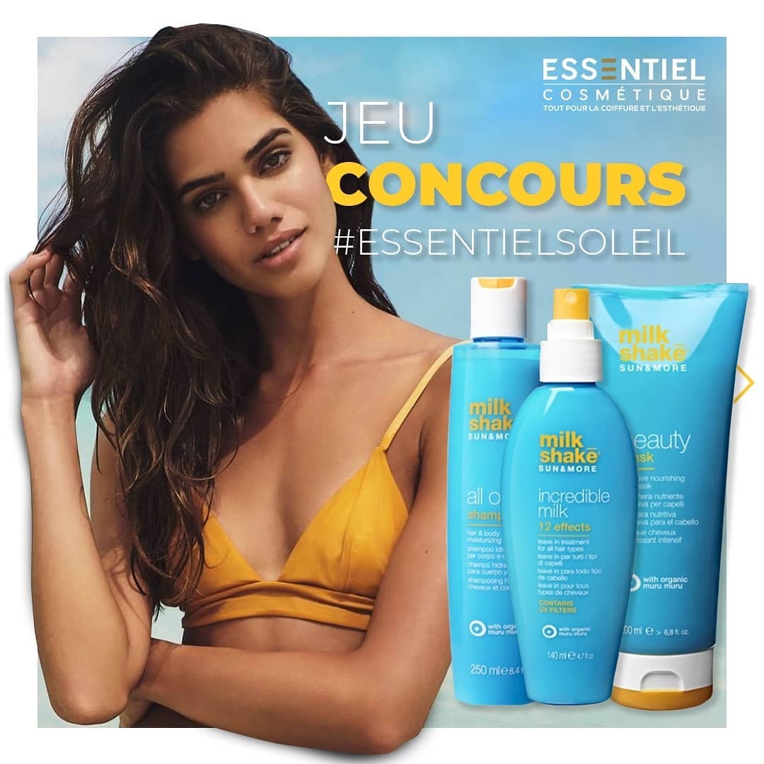
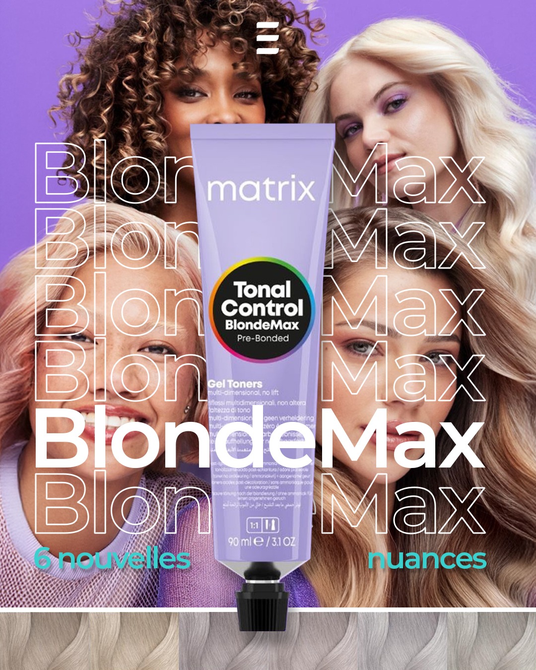
A second, ongoing challenge was how to stay true to our own visual identity while promoting well-known third-party brands like L'Oréal, Wella, or Schwarzkopf. The visual presence of those giants often threatened to overshadow our own.
The evolution journey
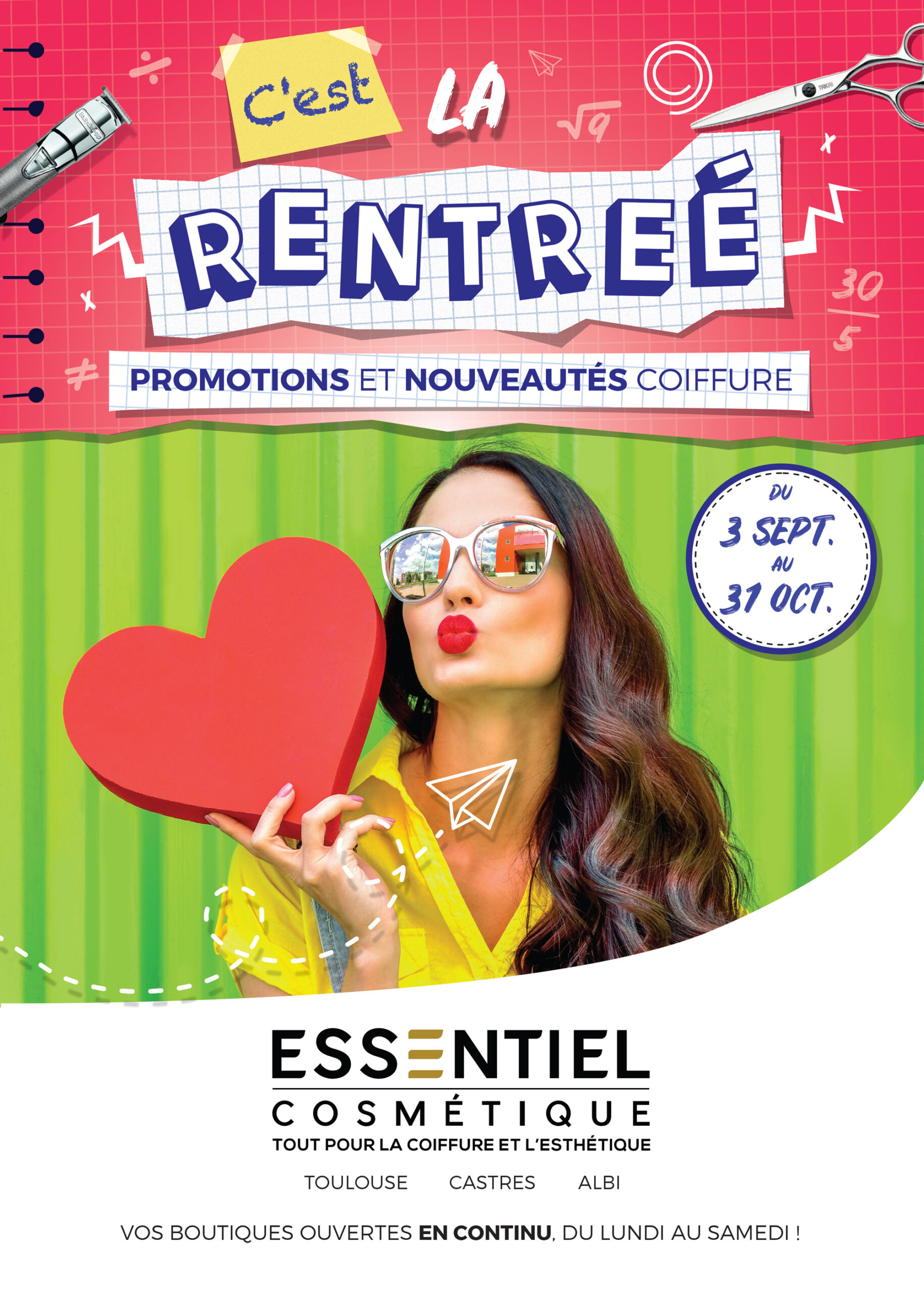
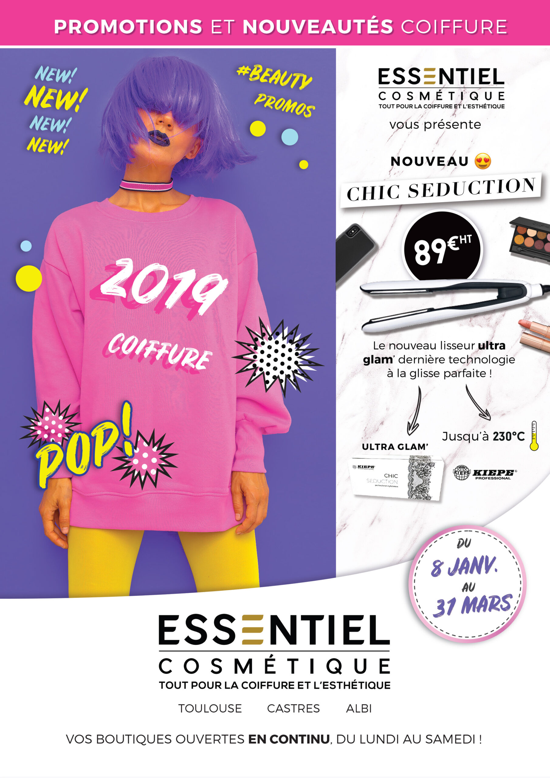
To clarify the brand’s voice, we had to strip things back to its essence. We left behind the Barbie-pink bags, crowded layouts, and textured backgrounds. In their place: white space, structure, and a more curated, consistent photographic tone across all platforms.
01
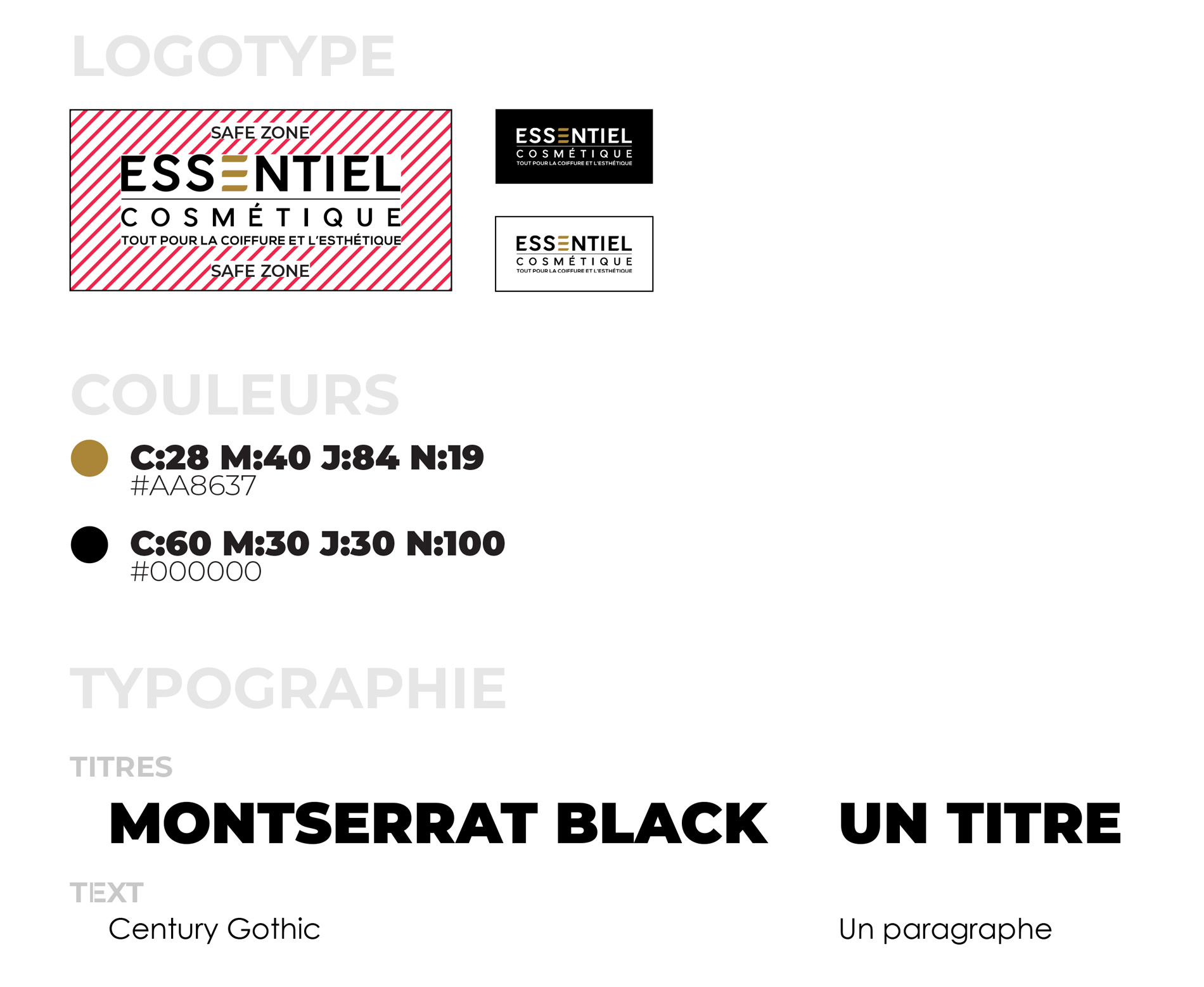
Expansion of the logo kit
As it was, the logo was not totally ready to be used on every plateform. There were only two versions: the full logo in black and the full logo in white which limited its scalability. I extended the logo kit to include new variations in size and color. Monochrome versions created challenges for the distinctive “E,” which I solved by using a stroked version to maintain recognizability.
02
Fonts
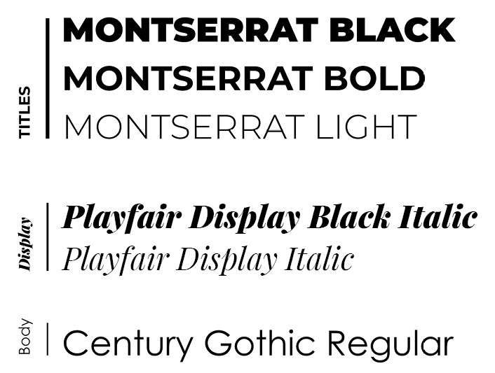
The brand originally used two fonts: Montserrat Bold for titles and Century Gothic Regular for body text. I introduced Montserrat Regular and Black for clearer hierarchy and contrast.
As the brand evolved, it needed a typeface to soften the modern, geometric feel and echo the aesthetics of the beauty world. After testing various script options, I introduced Playfair Display (Black Italic and Italic) for display use—mainly on covers and headers. It brought a touch of elegance and editorial flair to balance the rigidity of the sans-serifs.


Then
Now
03
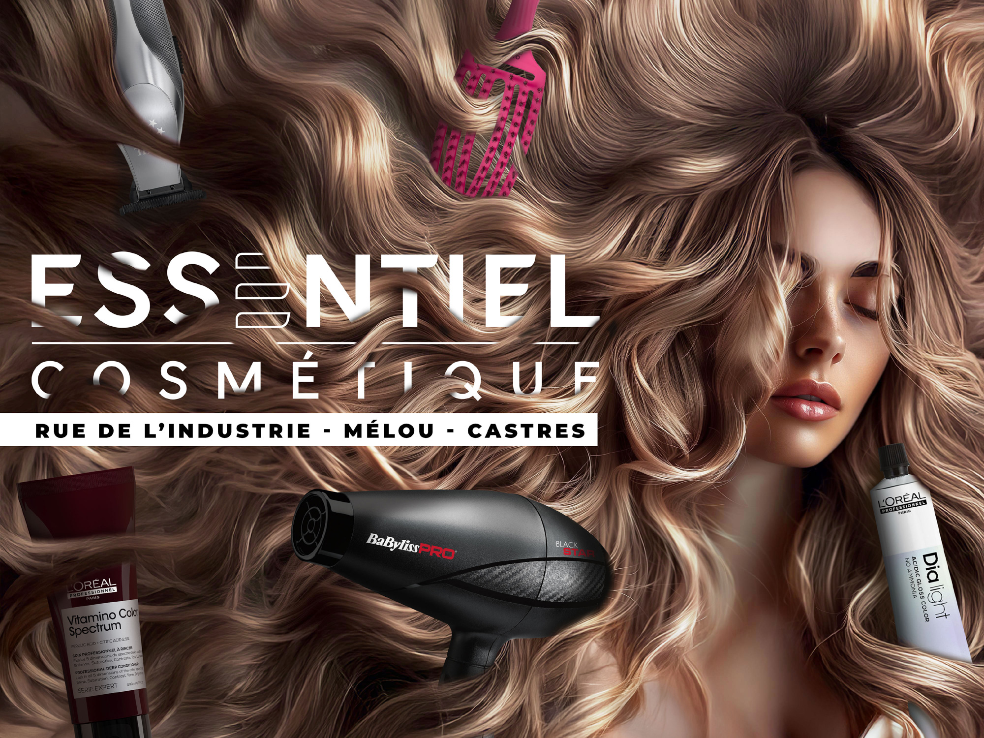
Photography Style
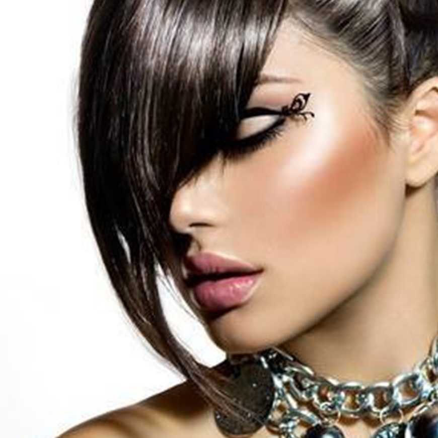
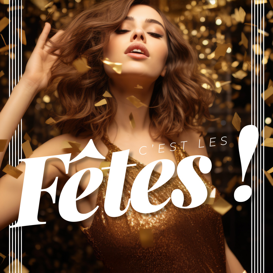
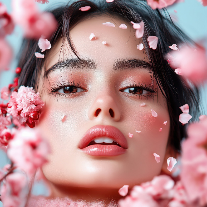
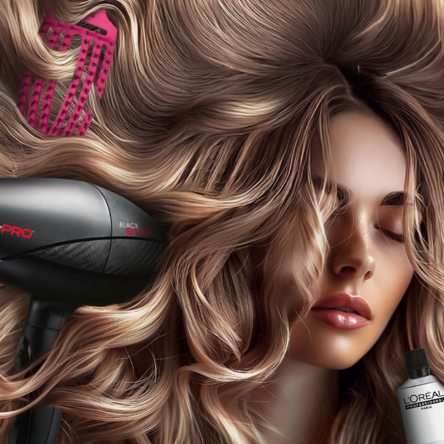
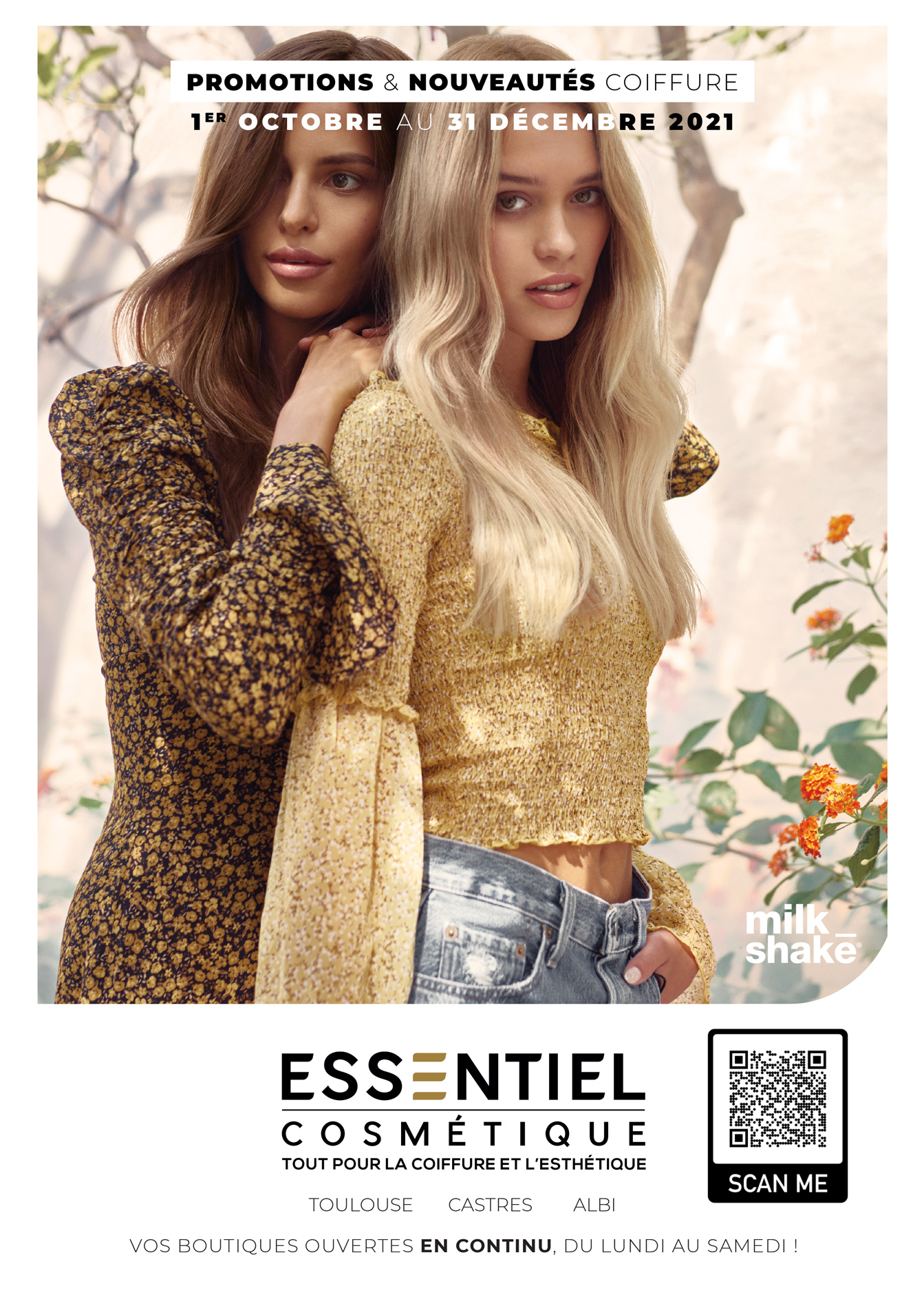
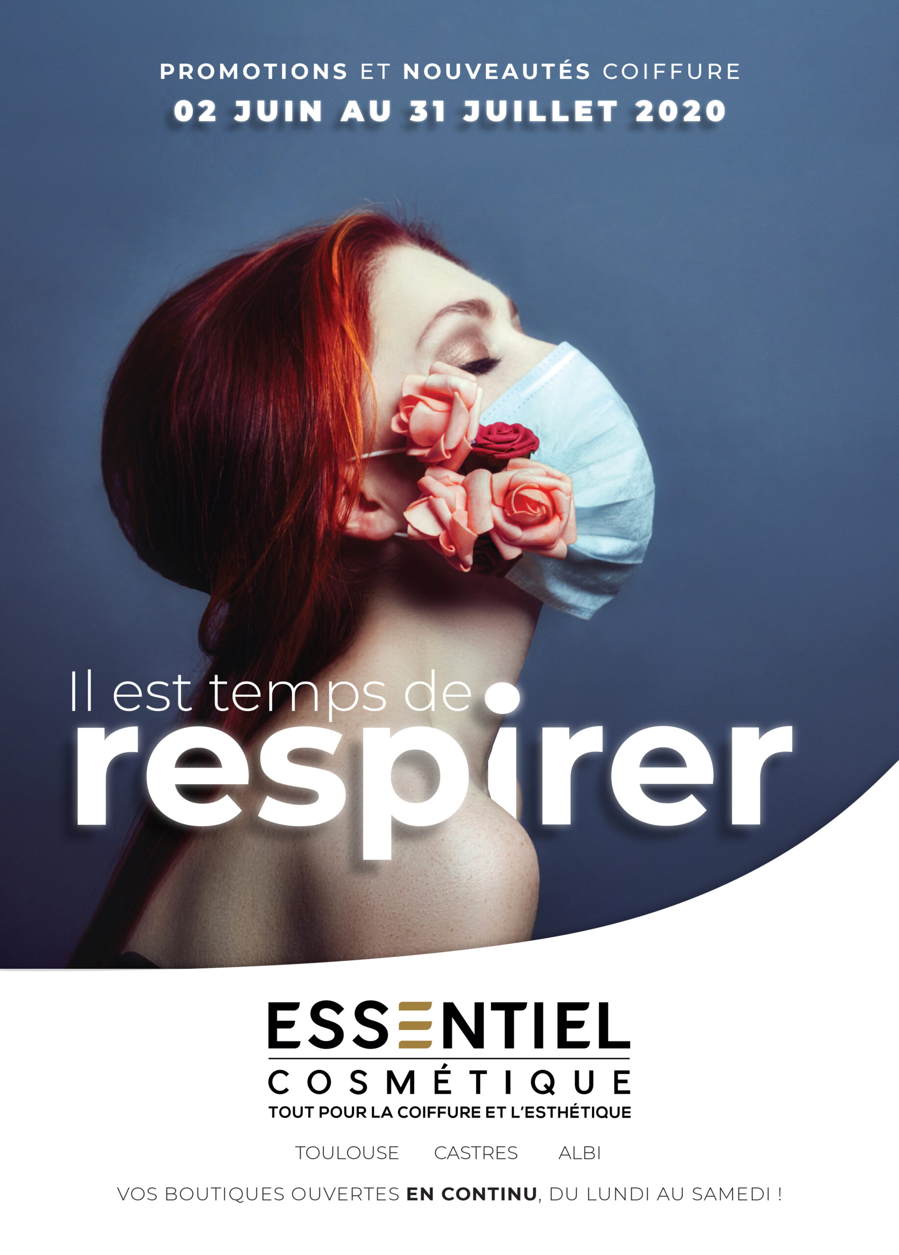
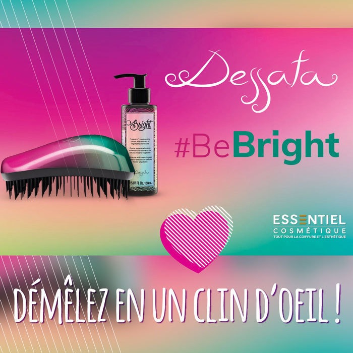
The photography style lacked consistency and leaned heavily on outdated aesthetics typical of the early 2000s beauty industry - think golden glitter, shiny gradients, and stark white backgrounds. With no budget for professional shoots, I turned to Adobe Stock, but made it a priority to avoid the generic “stock photo” look. My goal was to evoke the tone and quality of beauty magazine editorials - carefully curating imagery that felt authentic, polished, and aligned with the evolving visual identity.
04
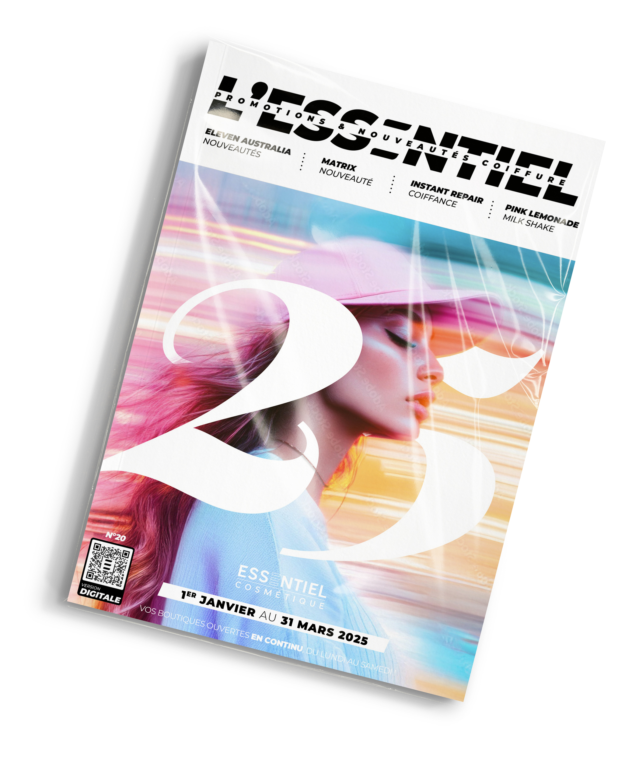
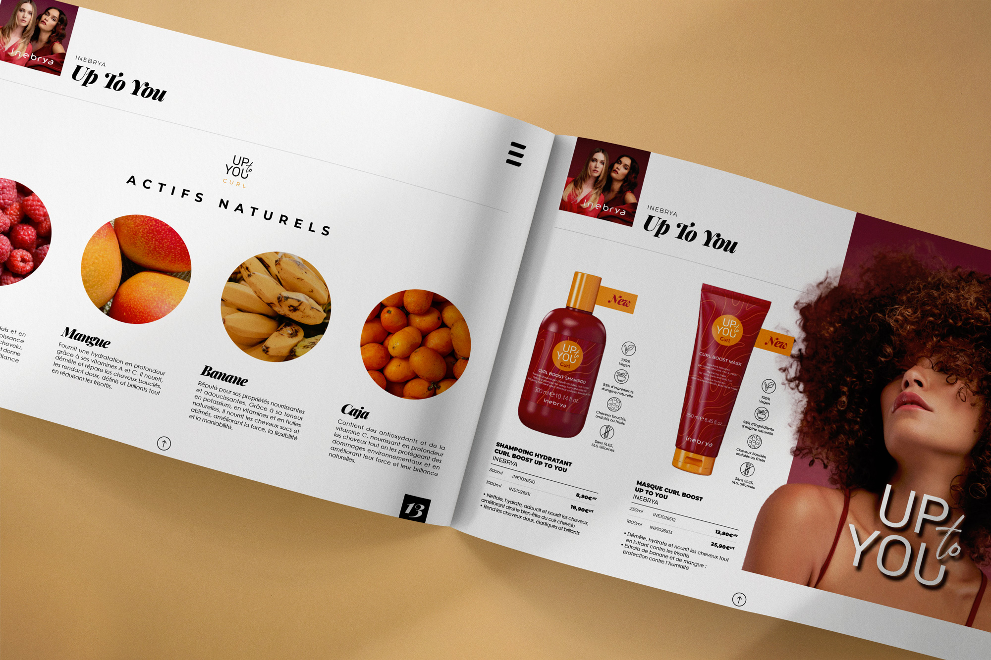
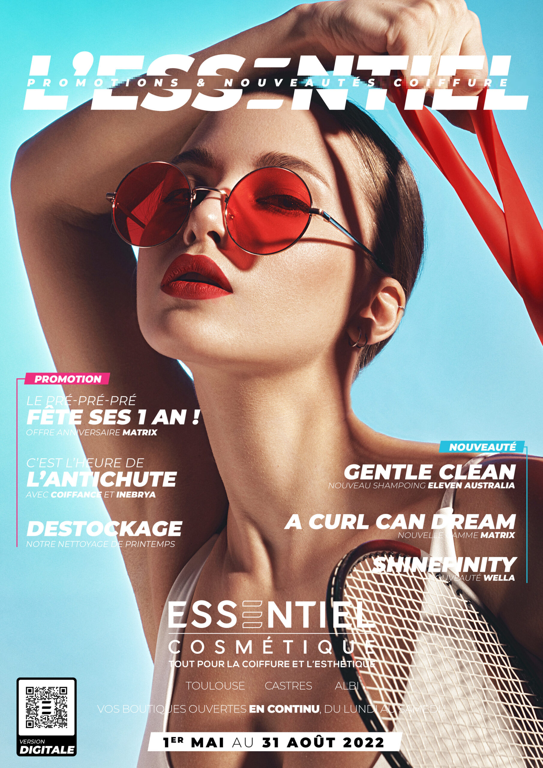
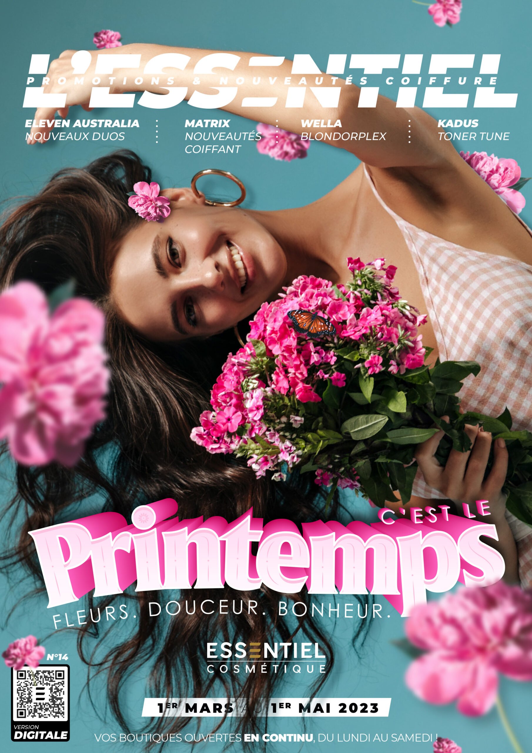
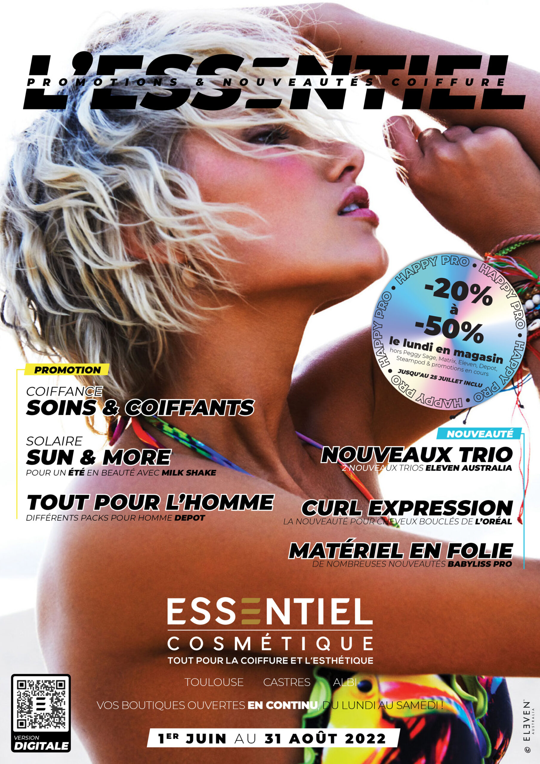
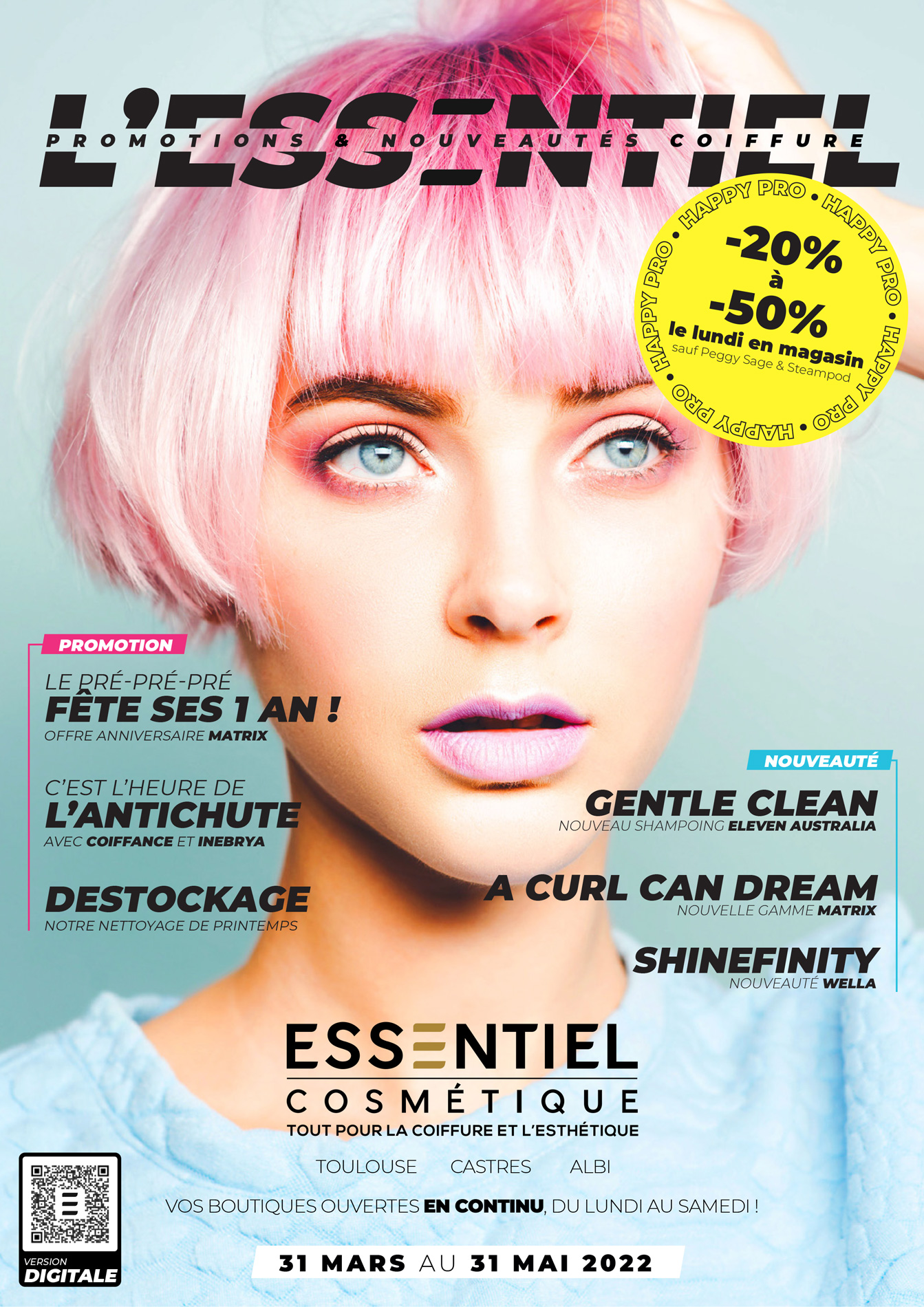
Catalogues
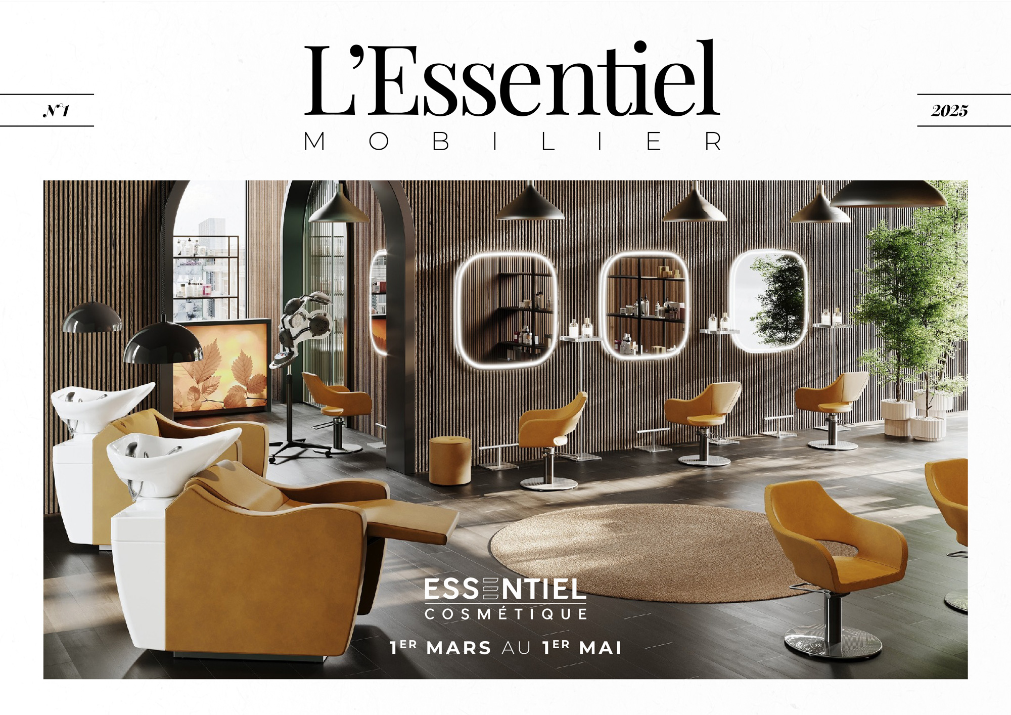
The main touchpoint - besides the physical shop - was the printed quarterly catalogue containing all the new products and the promotions for the season. To stand out from our competition, we made this catalogue look magazine like, especially on the cover with a rework of the name.
Later, in an effort to make our offers as clear as possible for our clients and our sales team, we embraced the "Less is more" approach to simplify and standardize the layout. Now, we have a clean and elegant solution that can be easy to replicate by other marketing team members.
Then
2020 - 2022
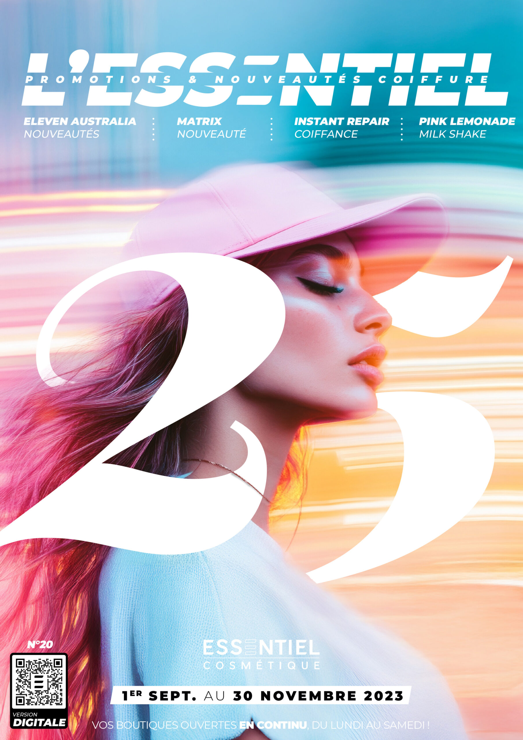
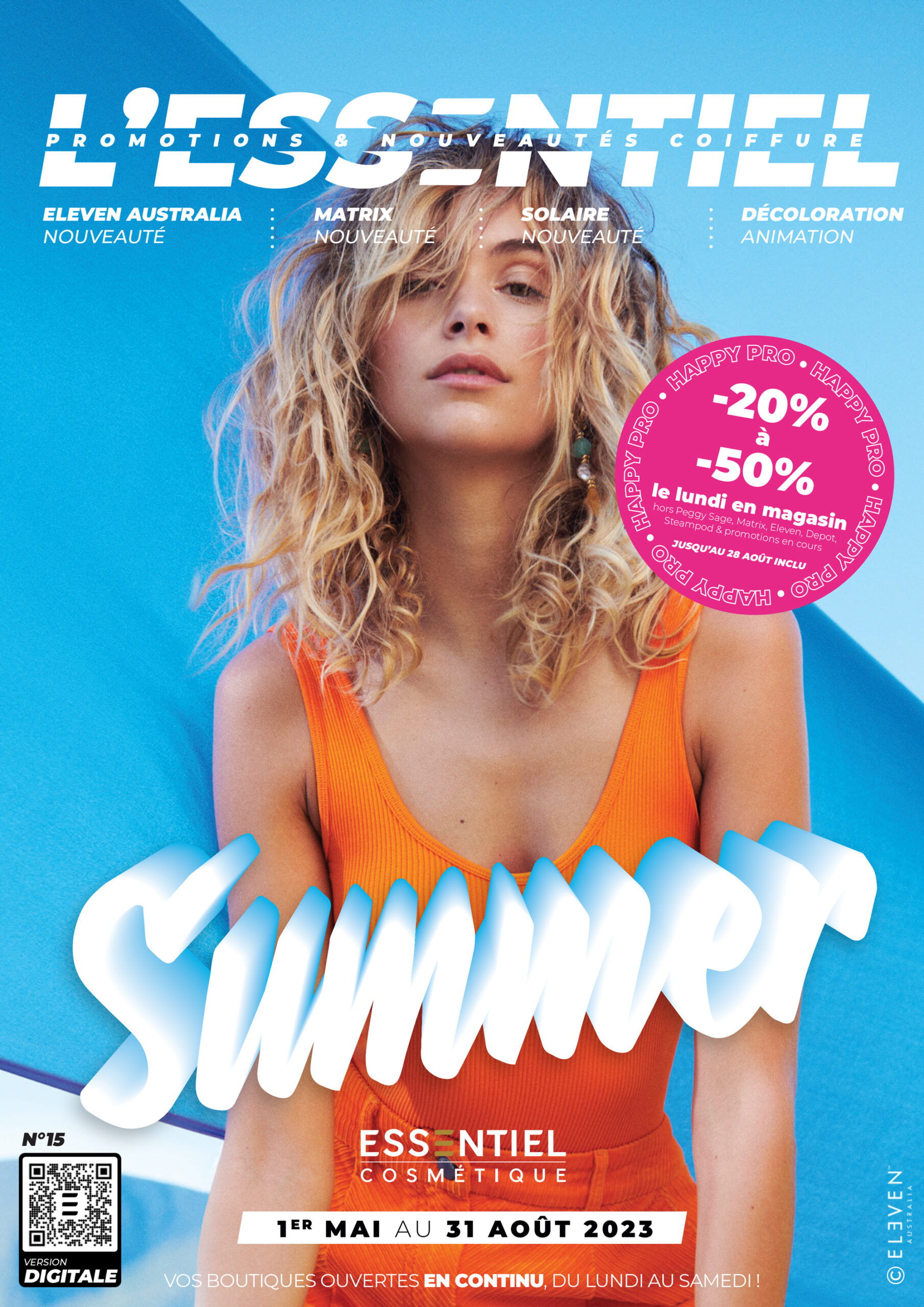
2022 - 2024
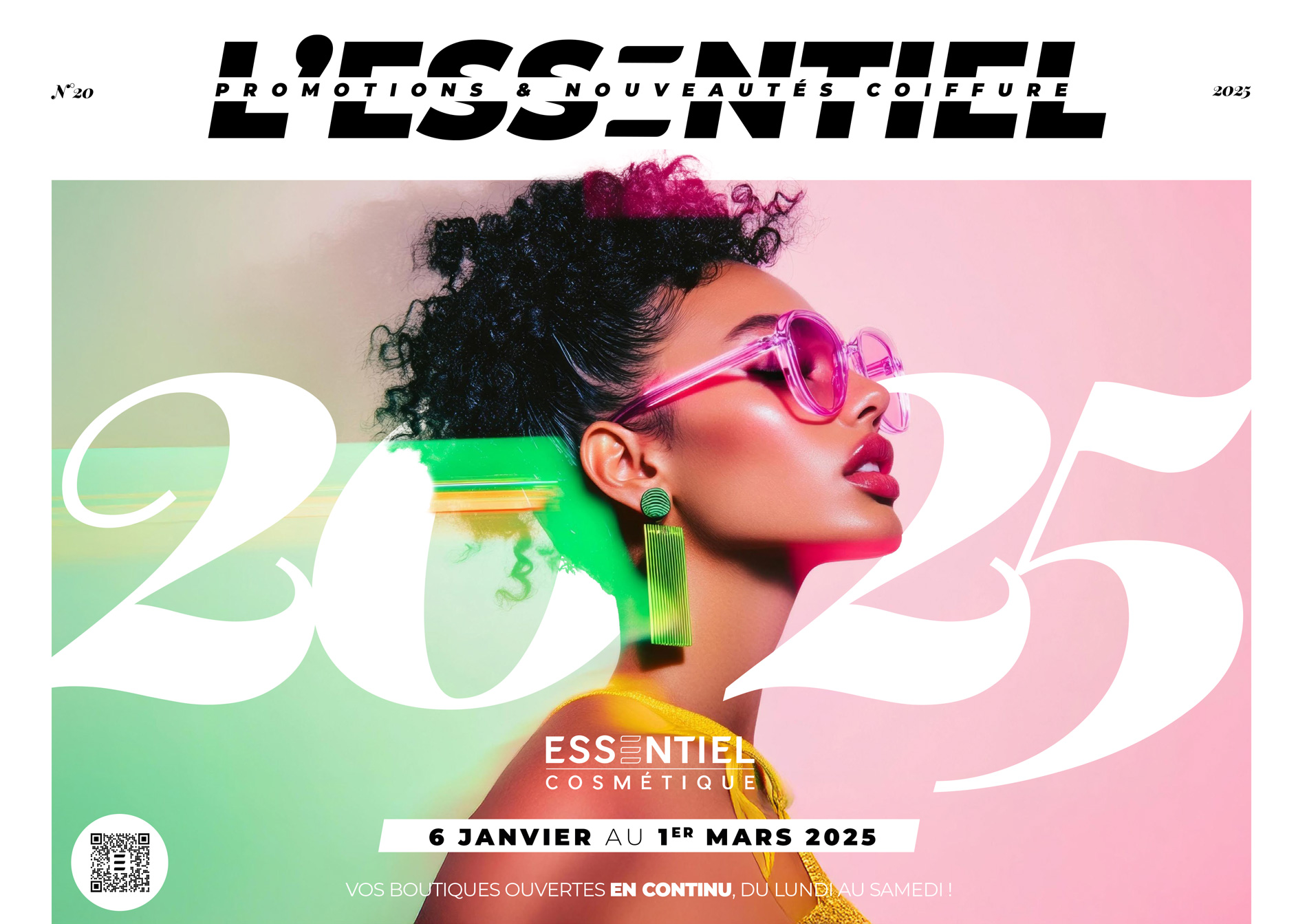
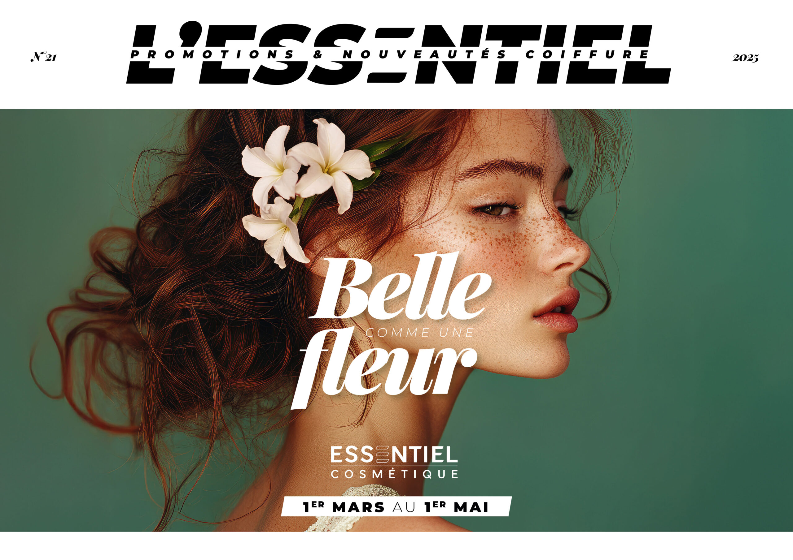
Now
05
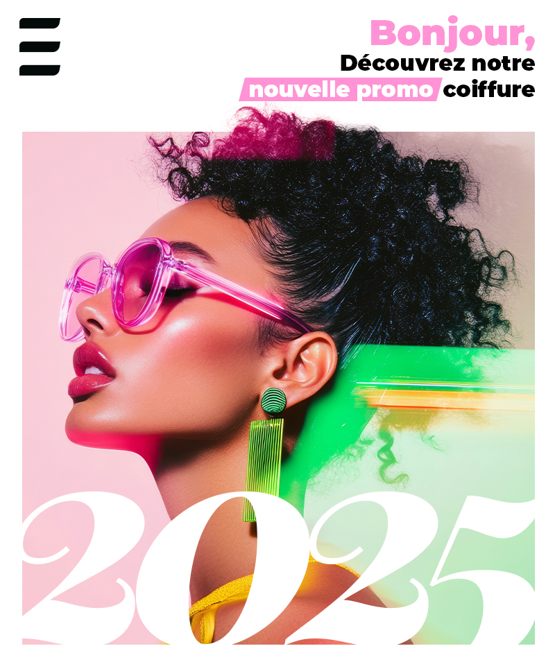
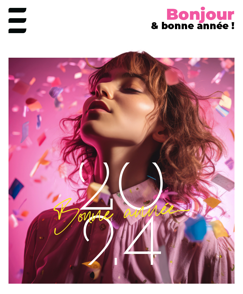
Social media
Though I only briefly managed social media, I introduced templates to standardize visuals across platforms. A signature white frame (including the logo) helped establish recognition while allowing me to play with layering and depth—bringing products and people to the forefront. Today, I support the team primarily on video content.
Then
2020
2025
06
Video Editing
In recent years, we expanded our brand presence through a growing variety of video formats - interviews, event highlights, teasers, and product presentations - for both internal and external audiences. I developed reusable templates that helped the marketing team produce content faster and with brand consistency. While editing many videos myself, we focused on strong storytelling, thoughtful pacing, and visual clarity—despite limited gear. That creative focus allowed us to deliver content that felt high-quality, authentic, and aligned with our brand.
Conclusion
Over six years, this project became more than just a job - it was a design lab, a brand evolution, and a deep dive into what it means to build consistency over time. I didn’t invent the brand from scratch - but I helped reveal what was already there, refine it, and make it work across every touchpoint. From printed catalogues to video content, from one-off campaigns to reusable systems, this project taught me how to stay flexible without losing focus - and how to help a brand speak clearly, no matter the platform.
Key Results
- Brand system scaled across print, web, social, and video
- Increased internal efficiency through reusable templates
- Stronger brand recognition despite third-party product dominance
- Cleaner, more editorial product catalogues for improved sales support
- Visual cohesion improved across all channels
What I Learned
- How to evolve an identity without erasing its roots
- How to empower teams to maintain visual consistency
- That brand work is never “done” - it’s shaped by every touchpoint
Selected Works
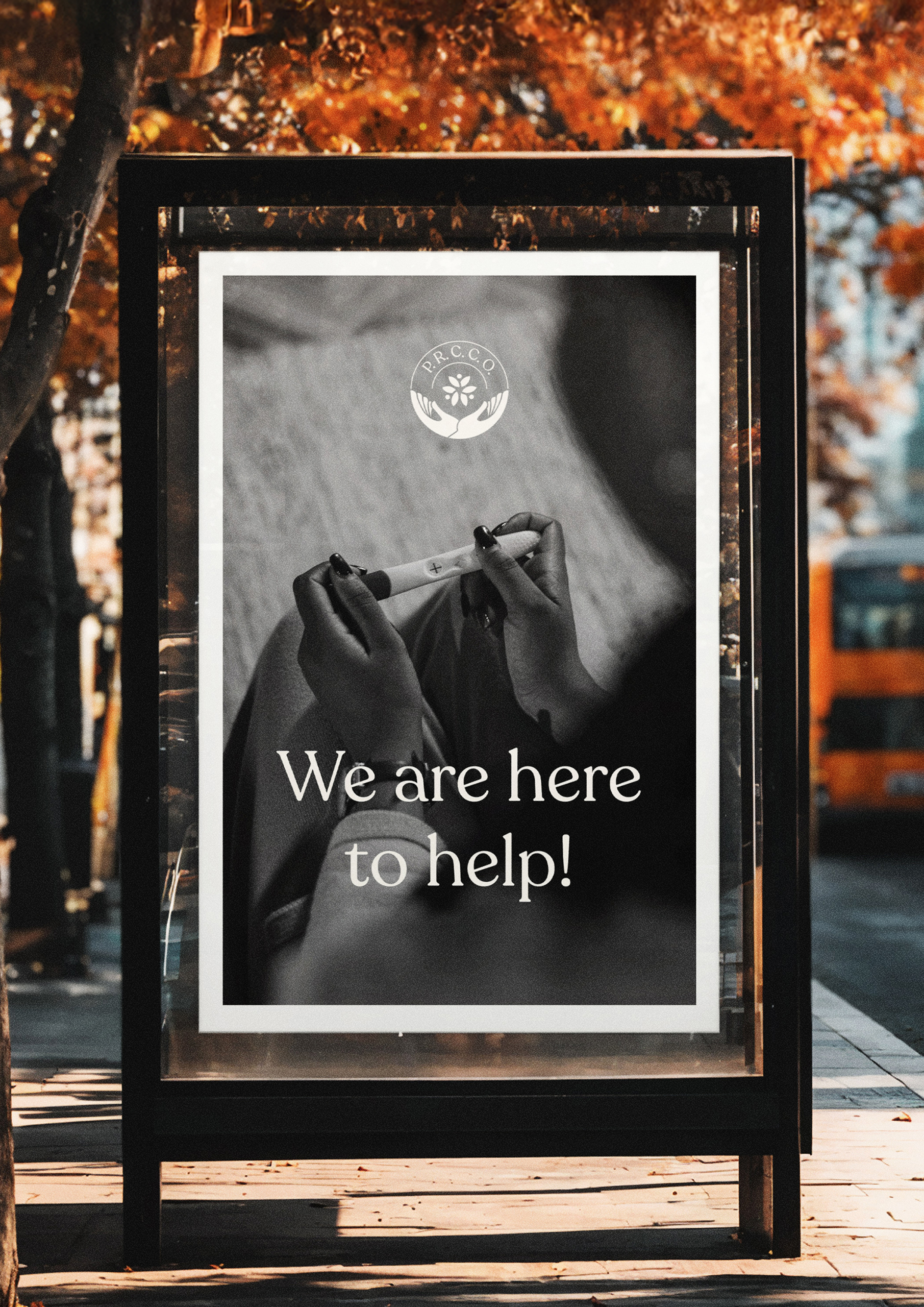
P.R.C.C.O.Logo Design
Essentiel CosmétiqueBrand Development
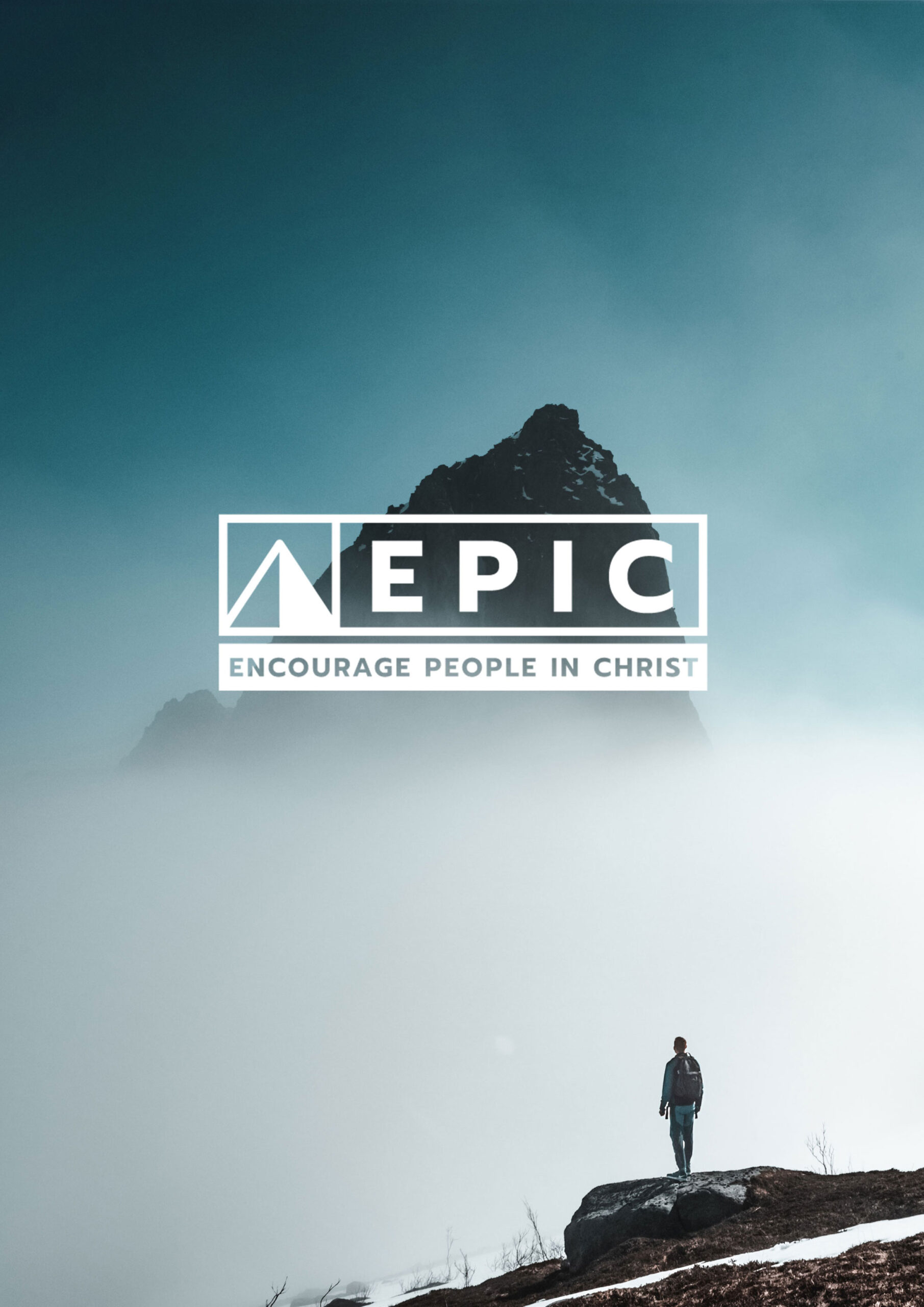
EpicLogo Design
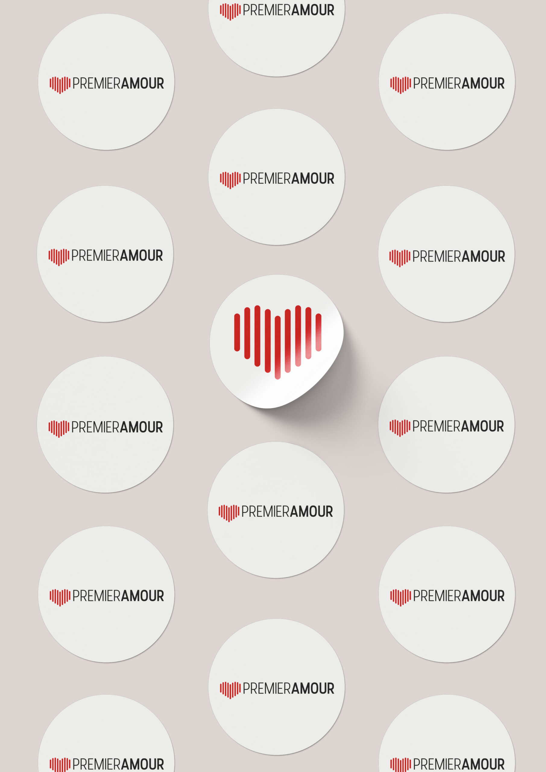
Premier AmourLogo
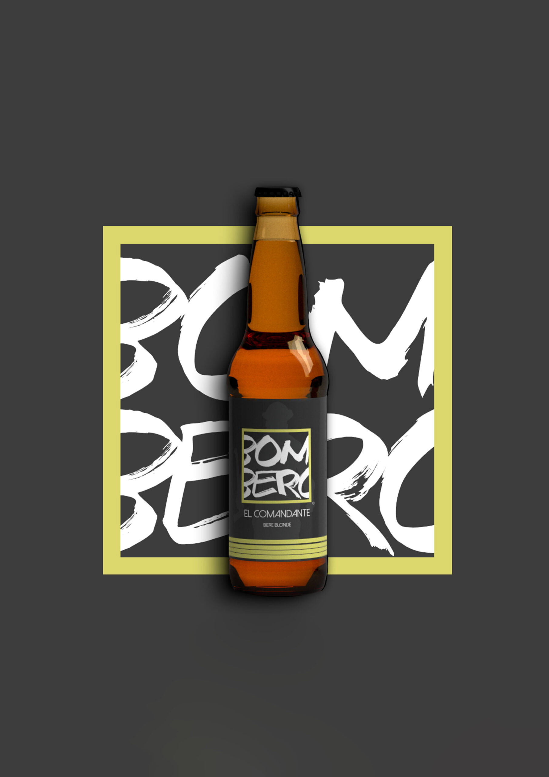
BomberoLogo & Packaging
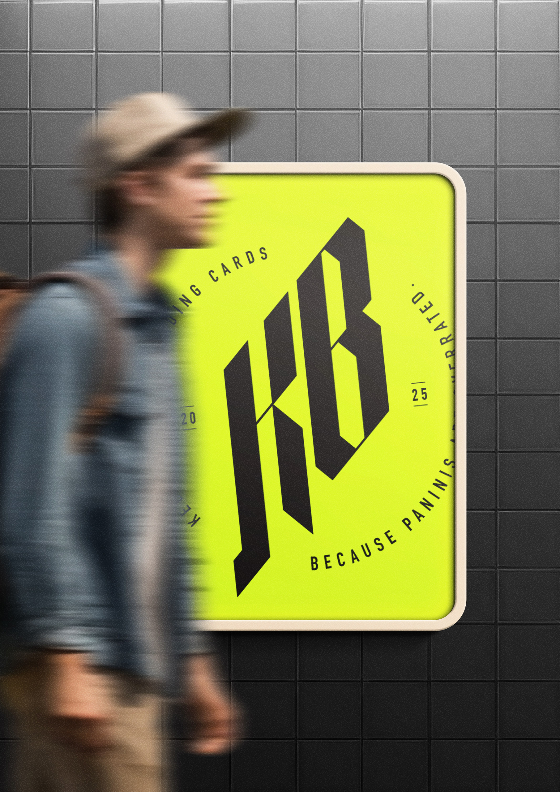
Kebab ProjectLogo