my first real big project.
the challenge.
Gear up a starting brewery with the branding materials necessary to launch.
the outcome.
A logo and several declinaisons of bottle packagings for the different kinds of beer.
Genesis
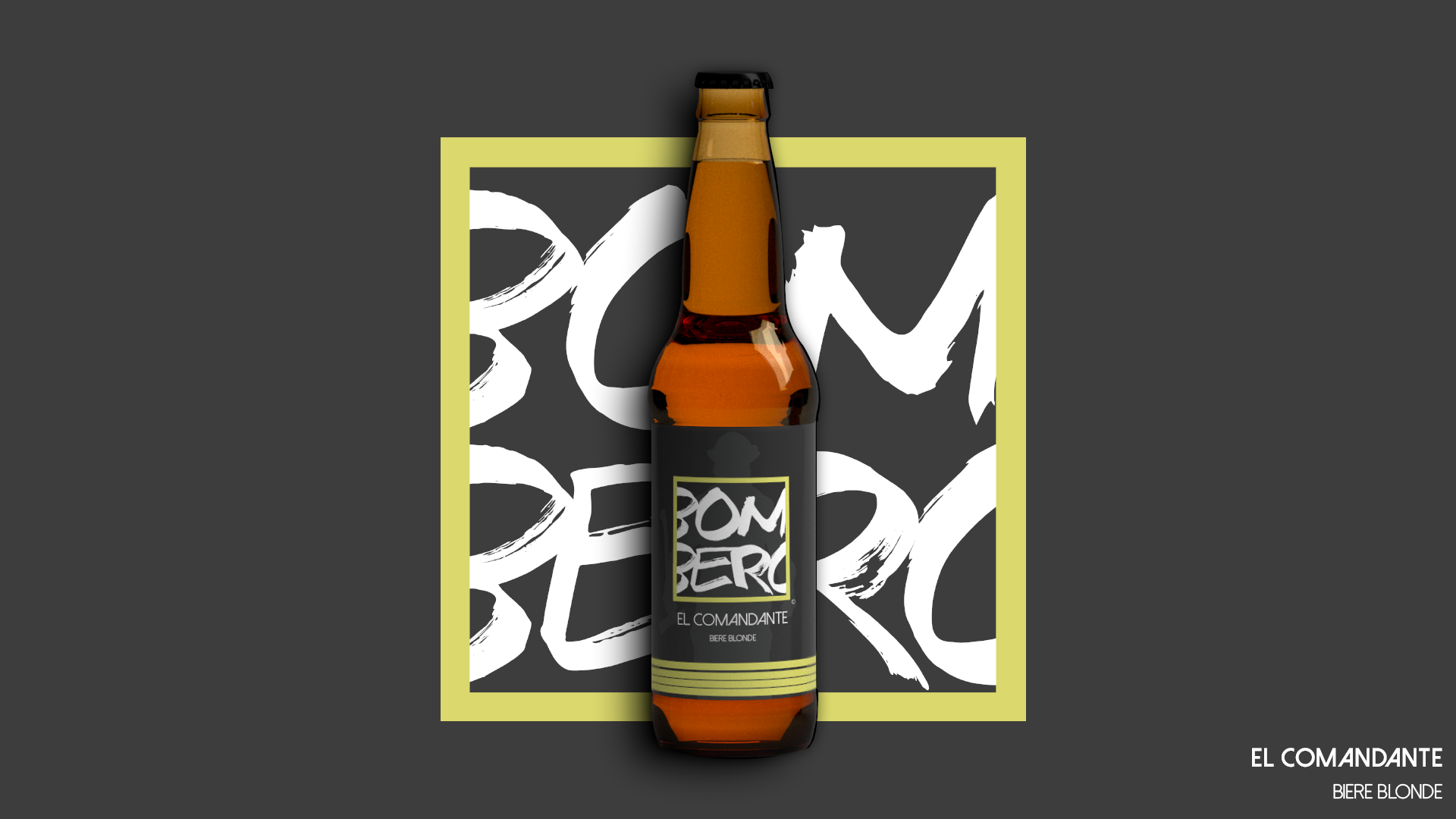
The brewery was preparing to launch their first beers and needed bottle packagings. There was no logo or other branding items so that had to be done first. I had a great deal of creative freedom, the only request was to stick to the name and the theme - Bombero means firefighter in spanish. So there it was, my first real big project.
The concept
From the very beginning, I knew I wanted to stay away from the firefighter clichés : red , fire, helmet or axes. What is a firefighter when you strip him or her of these attributes ? Someone courageous, strong, hard-working. Someone who reassure, protect, save. A hero. There is also a striking before and after a mission effect. Before, you get a spotless, prepared and elegant person in uniform. After, there are ashes, sweat and - sometimes - blood. I built my work around that idea. I pursued elegance while mixing in a few more rustic elements.

The logo
I blended the two in the logo. With a square as the delimiting shape, I intended to bring forth the stability, the strength of the firefighter as well as the simplicity of his mission : to save lives. One can also find a sense of modernity that reflects the brewery Bombero. The typeface is rougher, brush textured. It brings the grit of the mission in the foreground. The edges of the word "Bombero" are cut to add dynamism, energy to the logo. It shows that the company is not afraid to move towards uncharted territories.
The colors
Simplicity and elegance guided my choice of colors. I went for two shades of grey - anthracite and white smoke - some plain white an then, some touch of brighter colors -yellow, gold, orange or crimson - depending of the type of beer. It makes for good contrast and catches the eye easily.
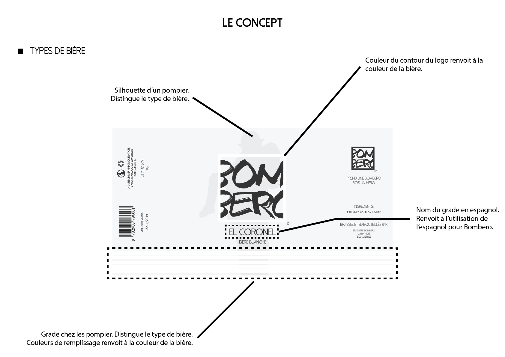
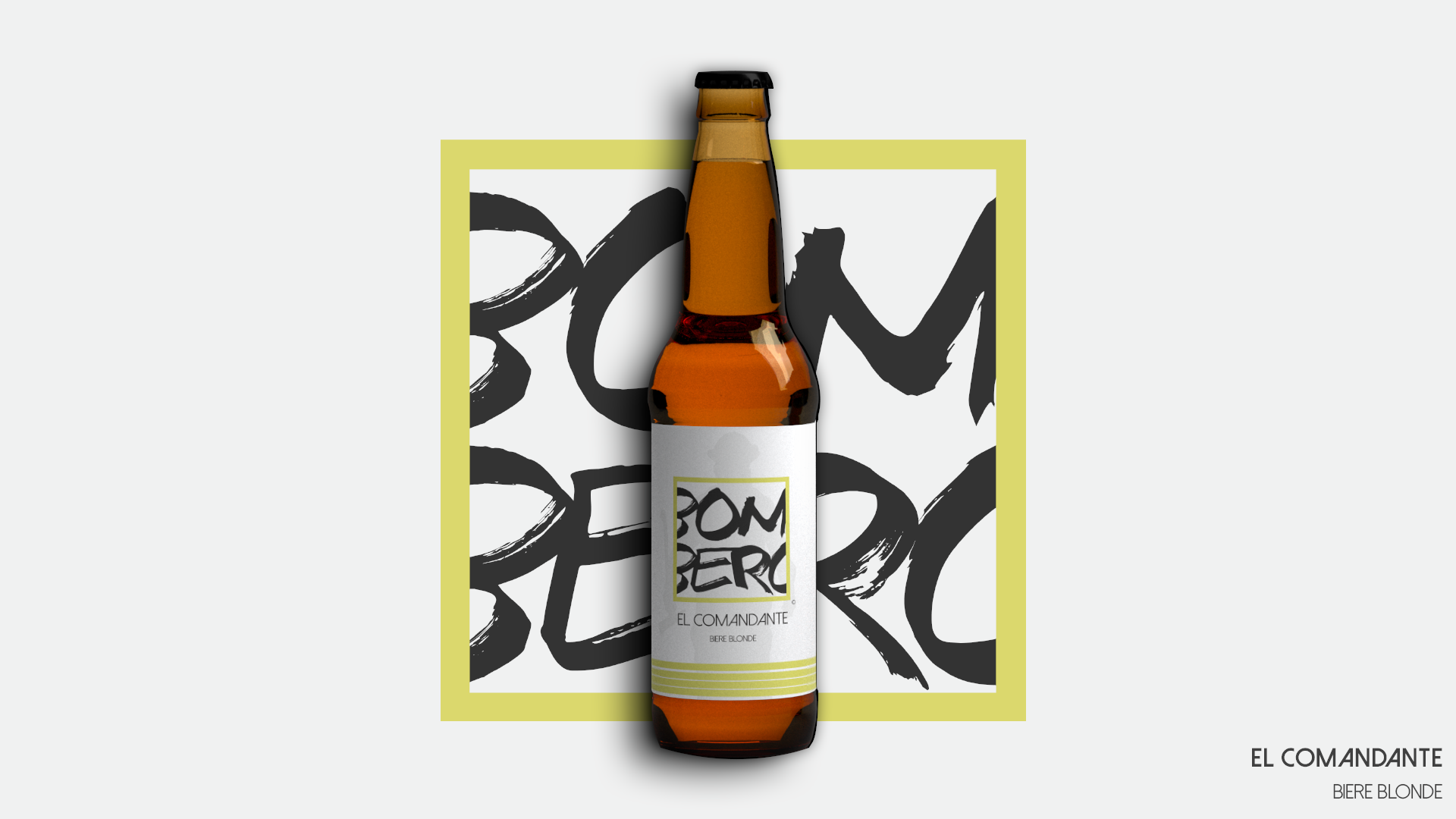
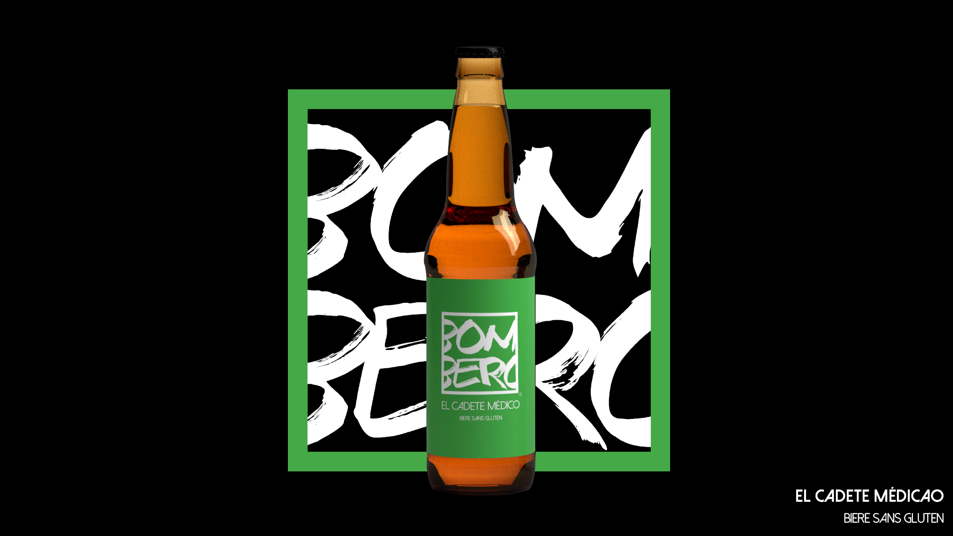
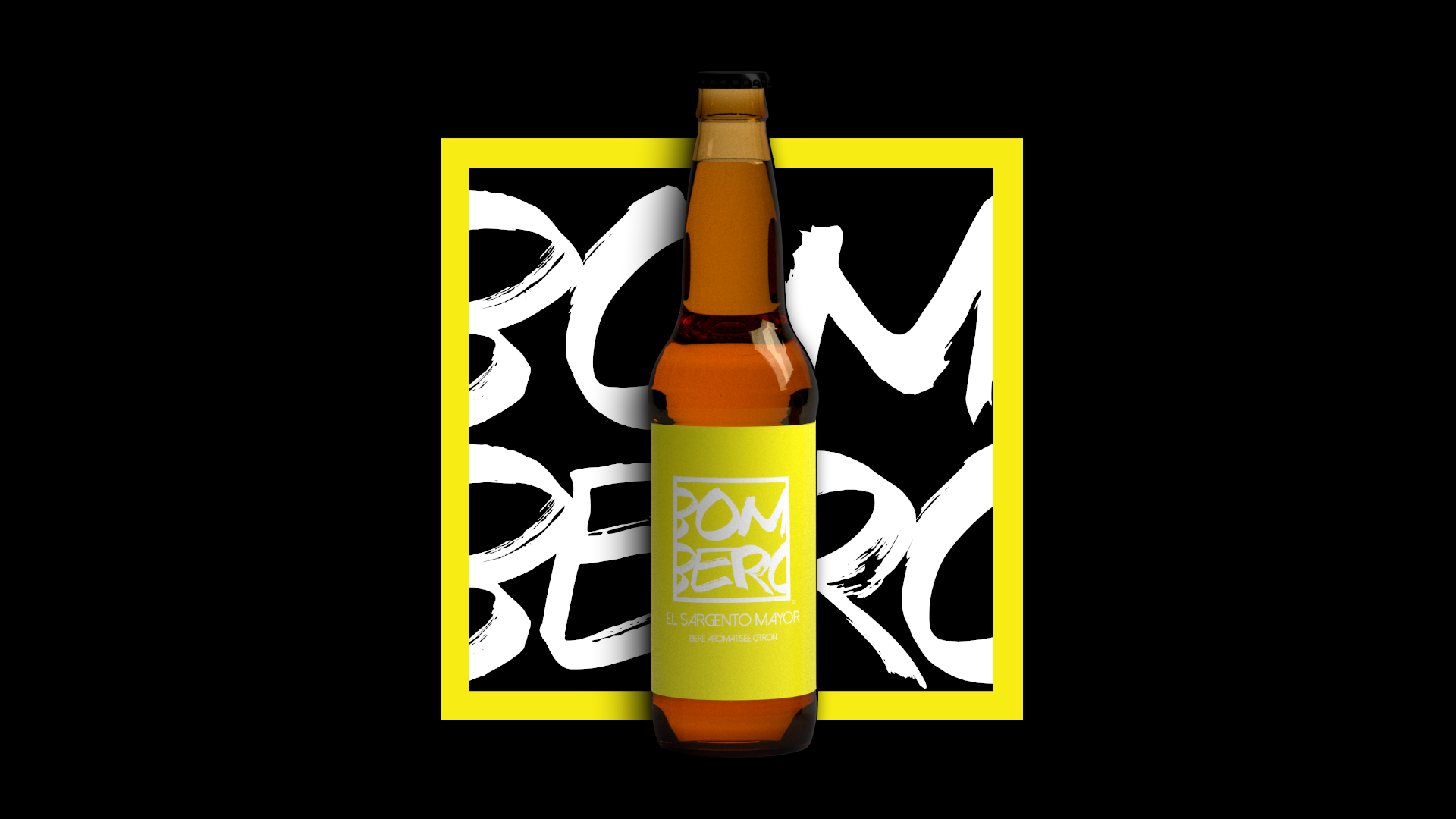
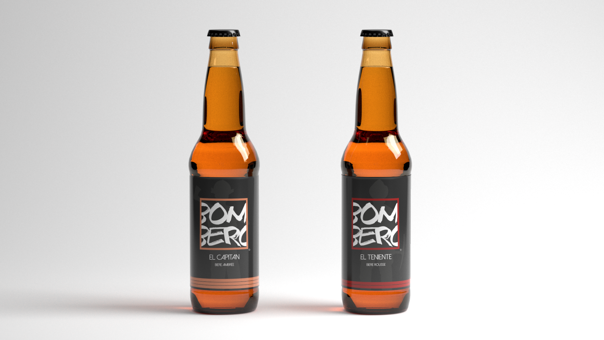
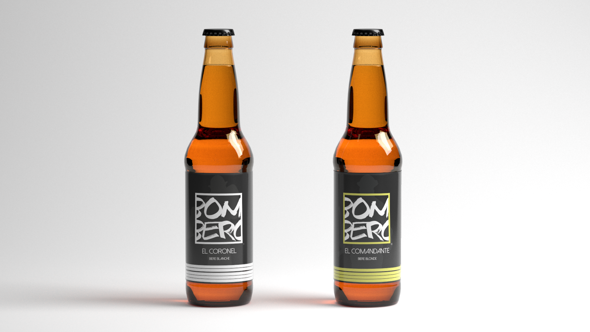
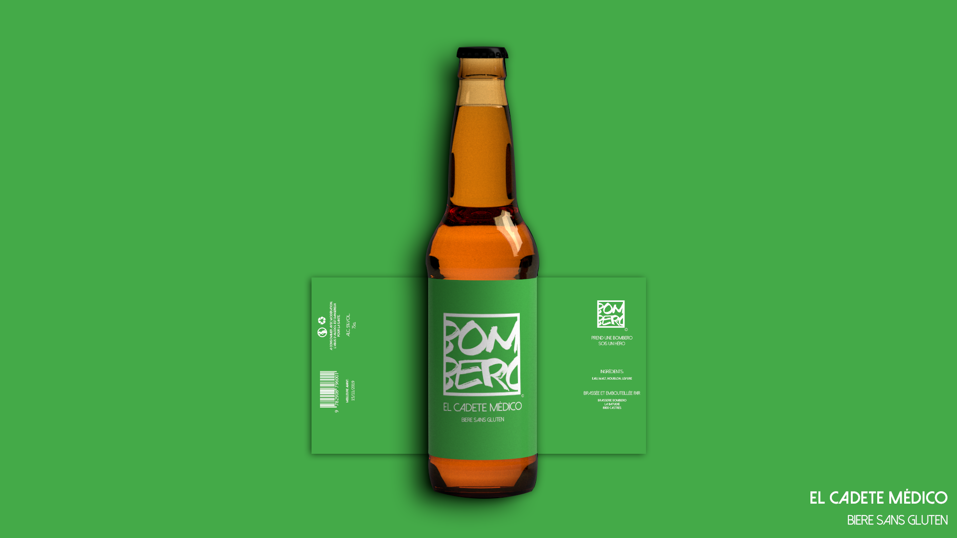
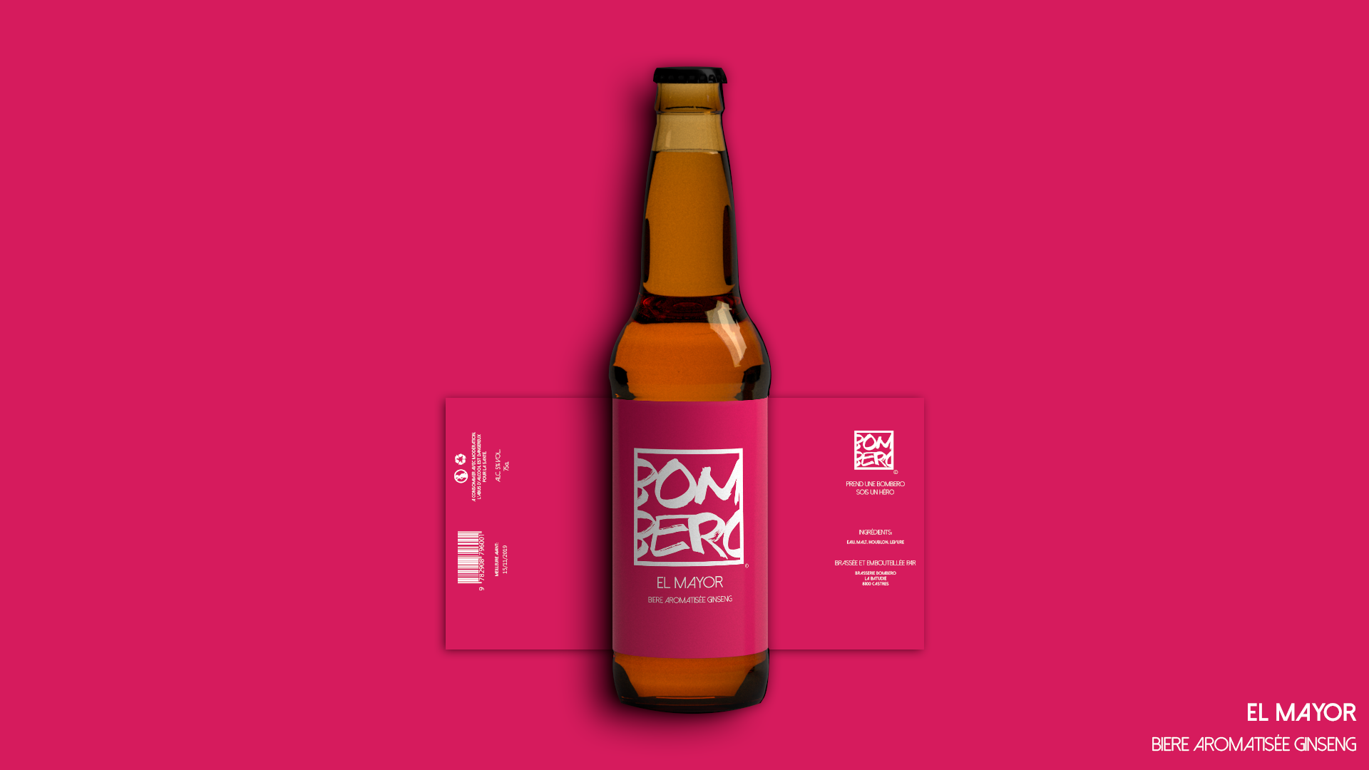
The range
The brewery wanted to be ready to distribute 7 types of beers : white beer, lager, amber ale, red ale, ginseng flavored, lemon flavored and gluten free. I had to find a solution to distinguish between them easily.
First of all, I assigned a fitting color to each according to the tint of their liquid or their ingredients.
Then, I wanted to develop better the firefighter theme with including in the background a silhouette of a different firefighter on each kind.
Finaly, I made a proposition of name for each beer. I used firebrigade officier rank - in spanish to fit with the name "Bombero". I added the fitting rank symbol at the bottom of the label.
The results

Selected Works
P.R.C.C.O.Logo Design
Essentiel CosmétiqueBrand Development
EpicLogo Design
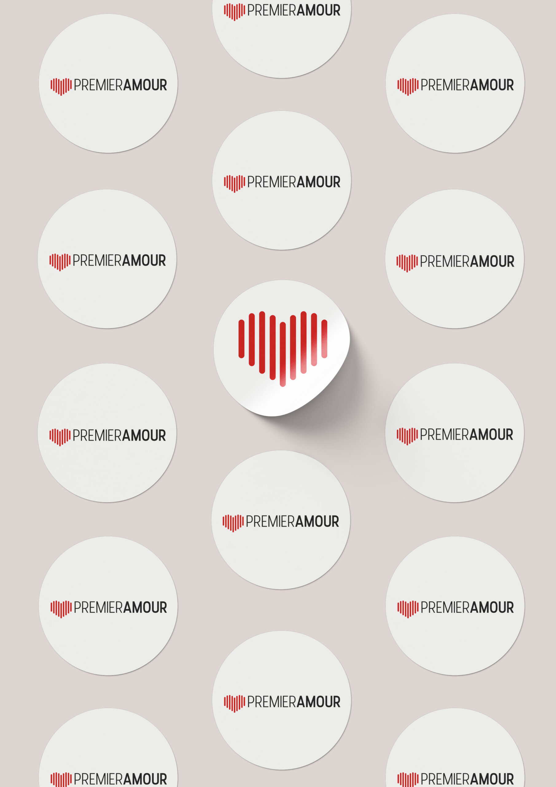
Premier AmourLogo
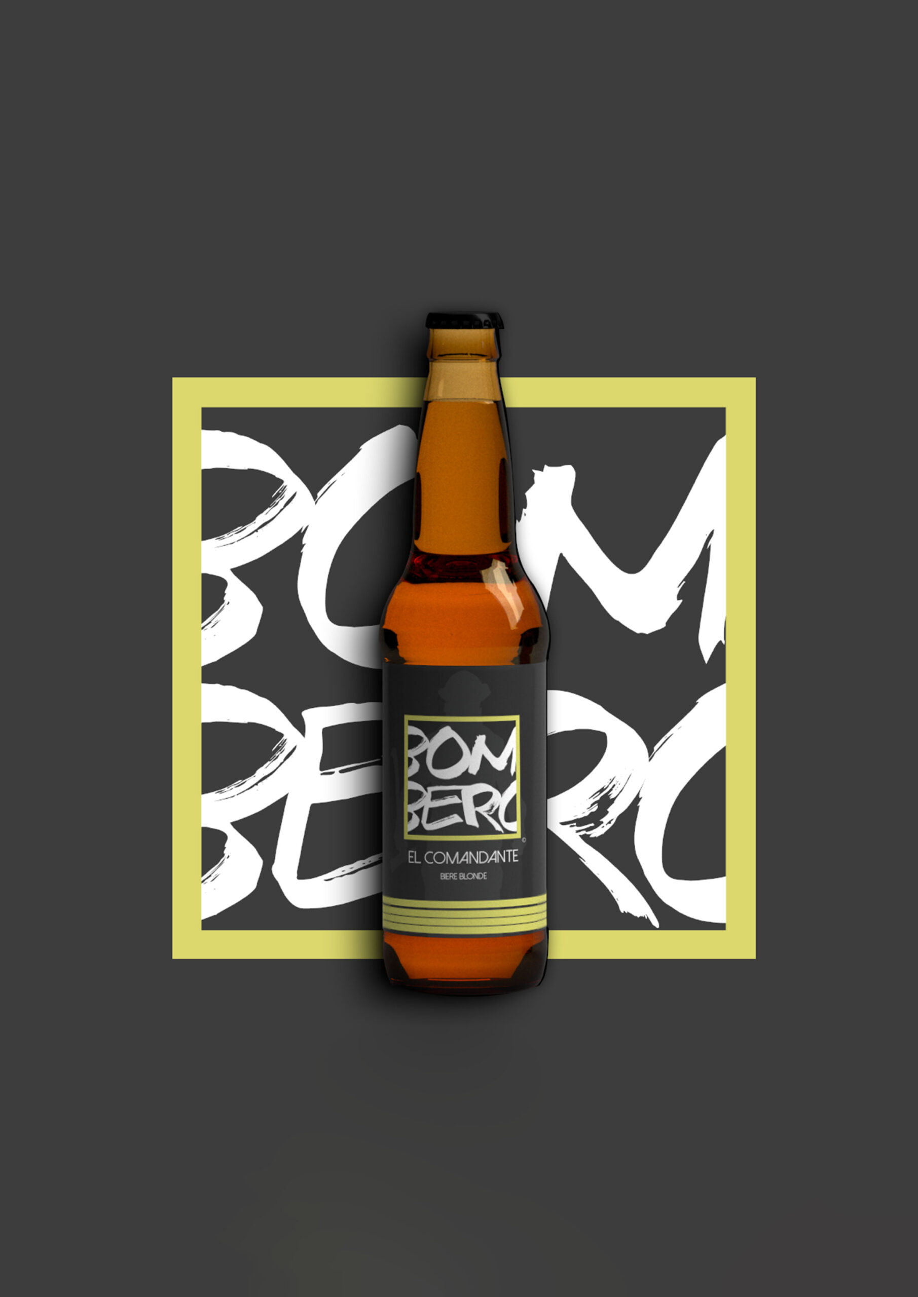
BomberoLogo & Packaging
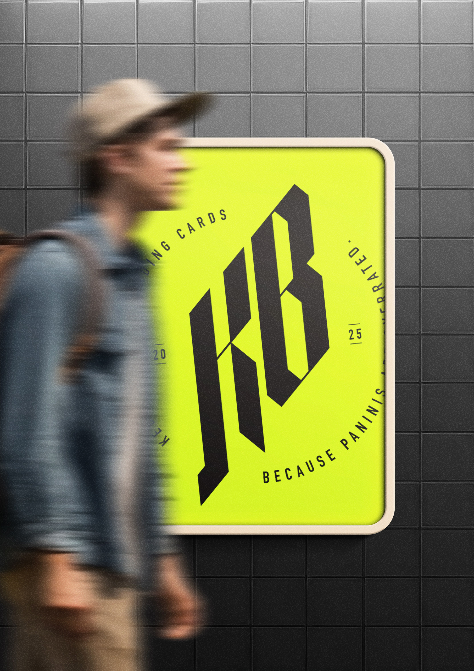
Kebab ProjectLogo
Portfolio
Branding
Advertising
Packaging
Webdesign
Blog
Life of a freelancer
Refreshed Logo
Design Process
© 2022 Aloïs Christinat. All rights reserved.